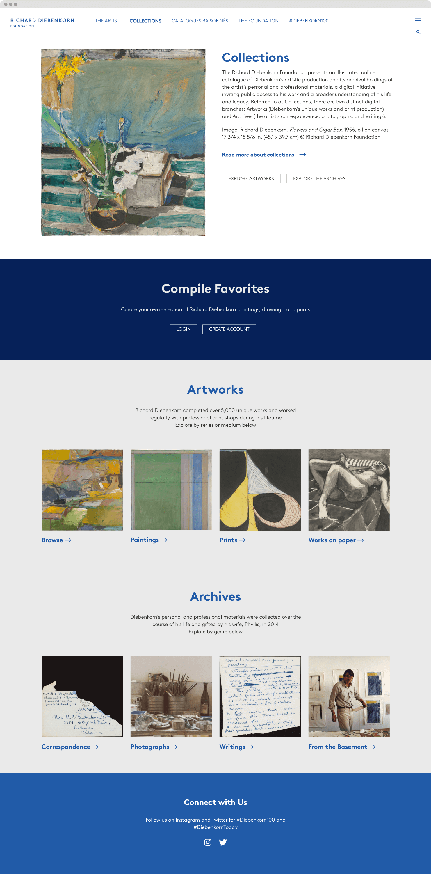
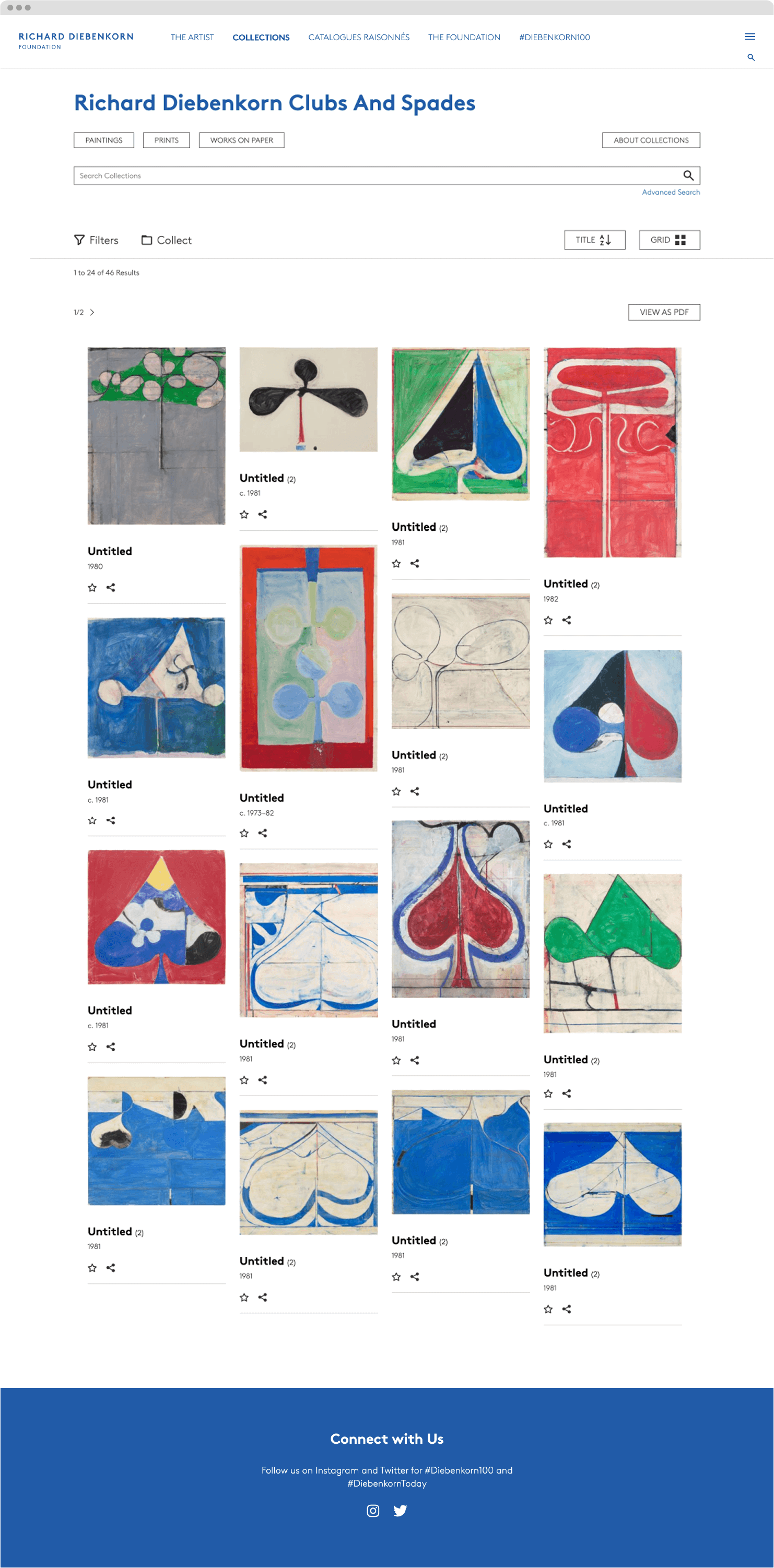
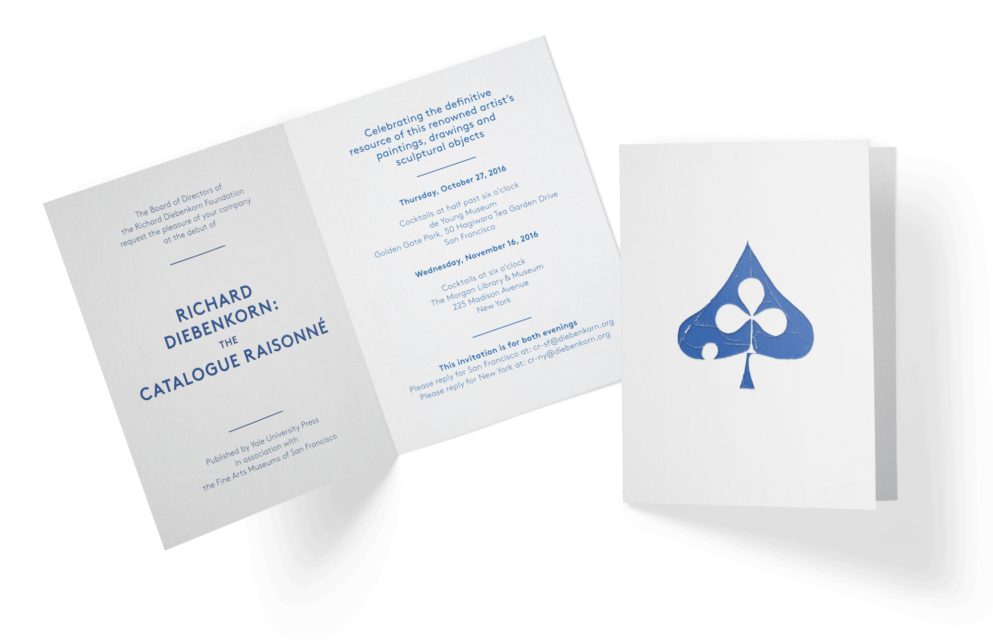
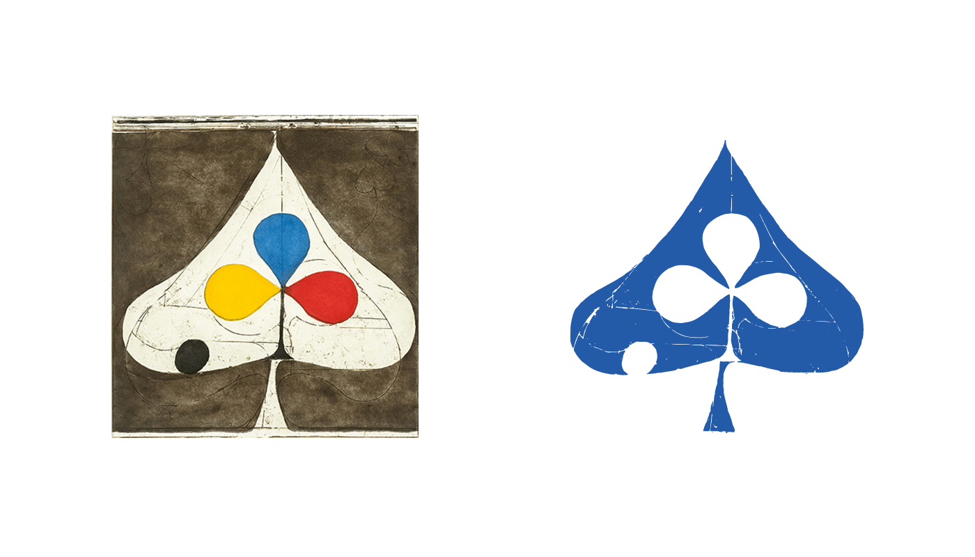
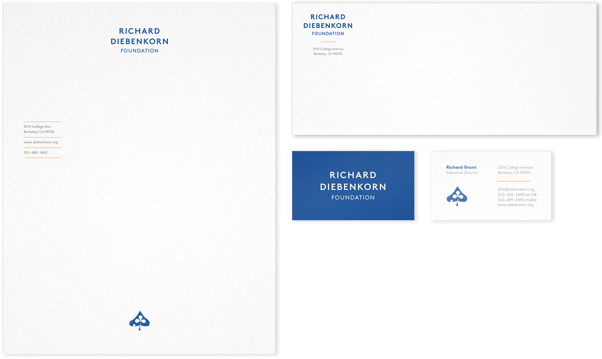
Richard Diebenkorn (1922–1993) was one of America’s most significant post-war artists, and for much of his career he was based in the Bay Area, where his family still resides. We were contracted to create a graphic system to represent the foundation which oversees the legacy, authenticity, and use of his work. Working with the foundation, we delved deep into who Diebenkorn was—both as an artist and a person. Early on we were told that Diebenkorn would have hated having the idea of designers creating a logo that represented him. Rather than take offense, this position helped guide our work towards an identity that felt true and respectful. The resulting wordmark is simple, sturdy, and direct, using a particular shade of blue often found in his work and paired with an etching from his iconic “clubs and spades” series.
SCOPE
- Brand Identity
- Brand Guidelines
- Communications
- Social
- Website / UI / UX
PARTNERS
- Reputation: Brent Foster Jones
- Web Development: Kanopi
- Printer: Oscar Printing
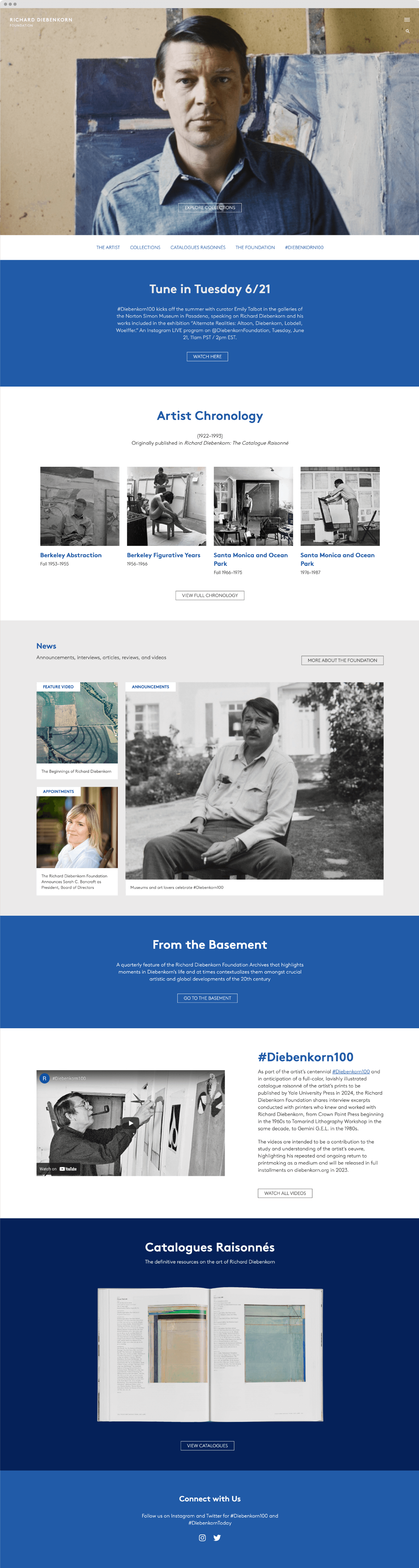
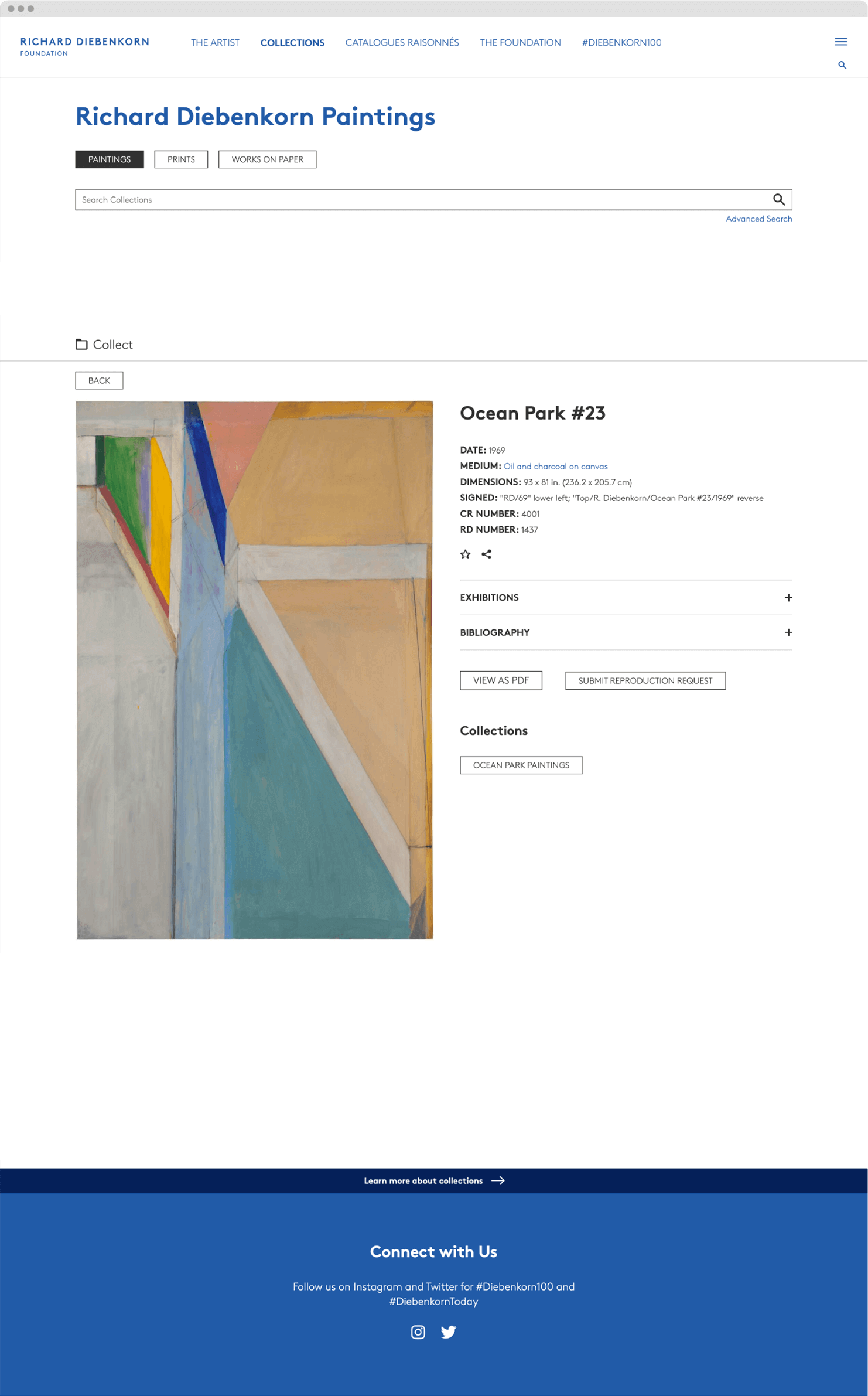
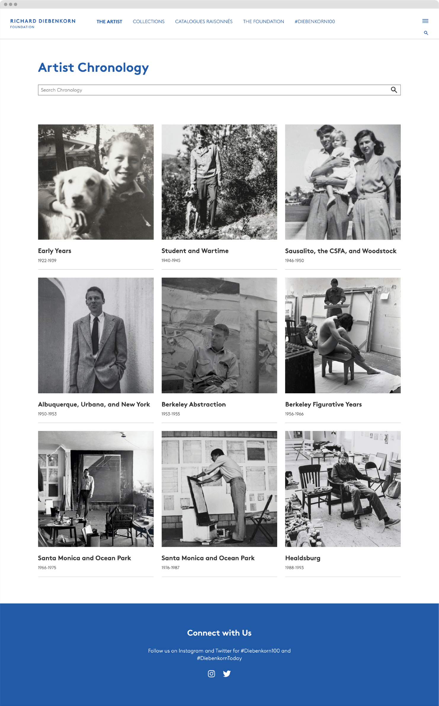
The website was created as a comprehensive online home for the Foundation. In addition to an rich biographical section organized by era, the site houses an extensive searchable archive of the artist’s works—categorized by type and period—providing an invaluable resource of vetted works for scholars, curators, collectors, and fellow artists.