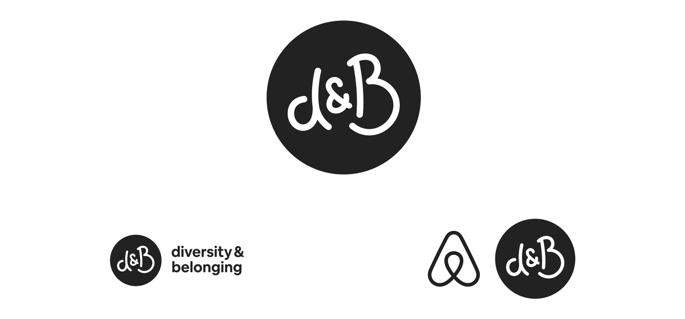
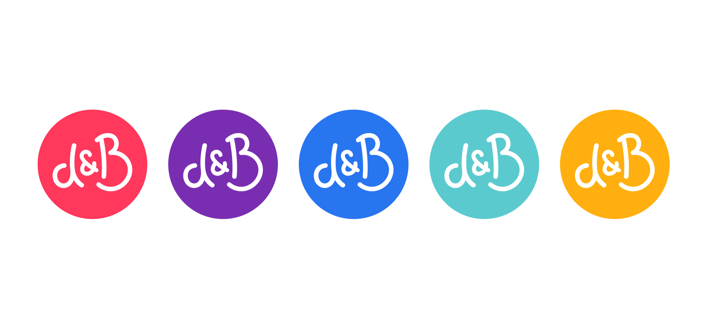
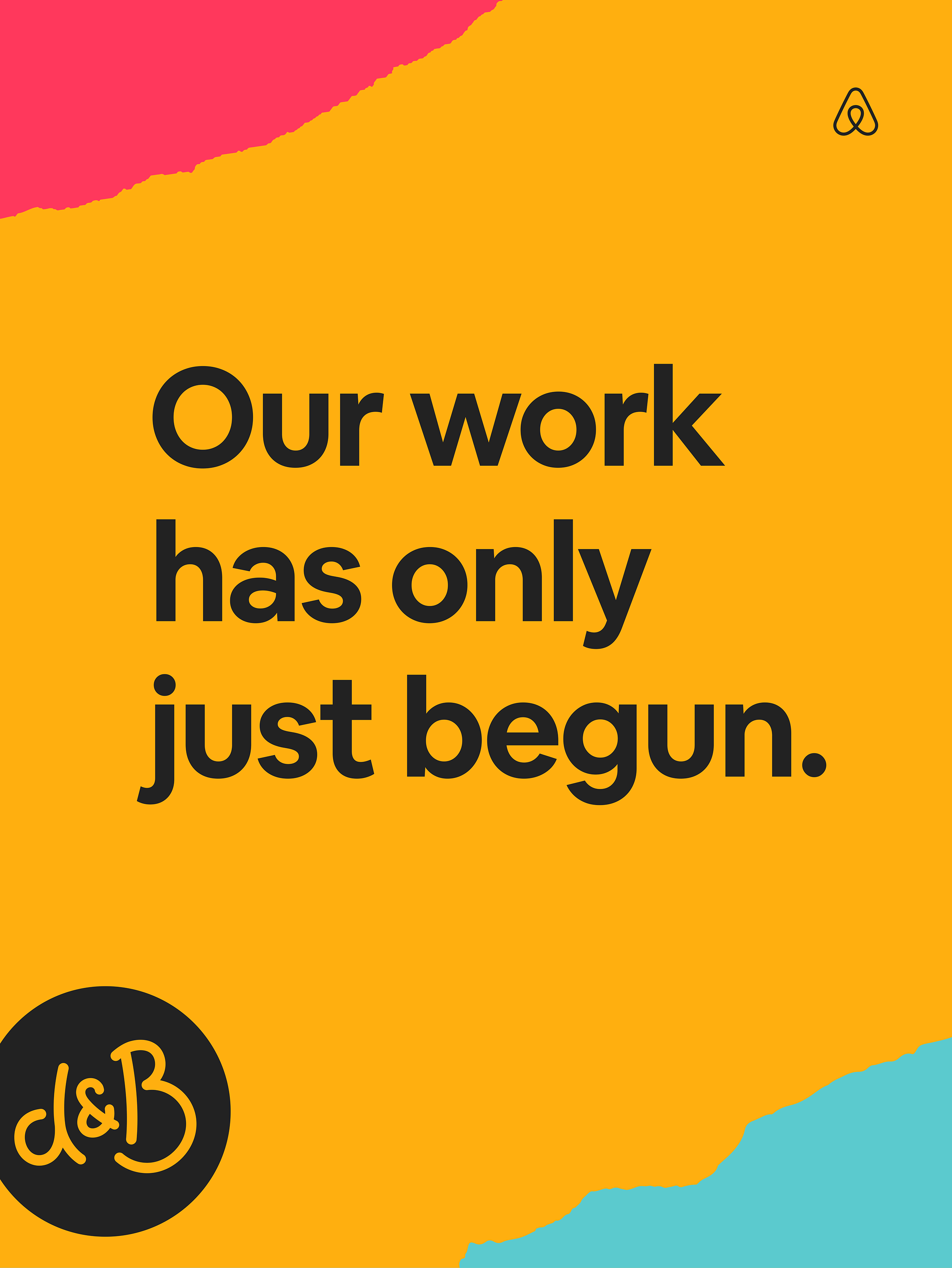
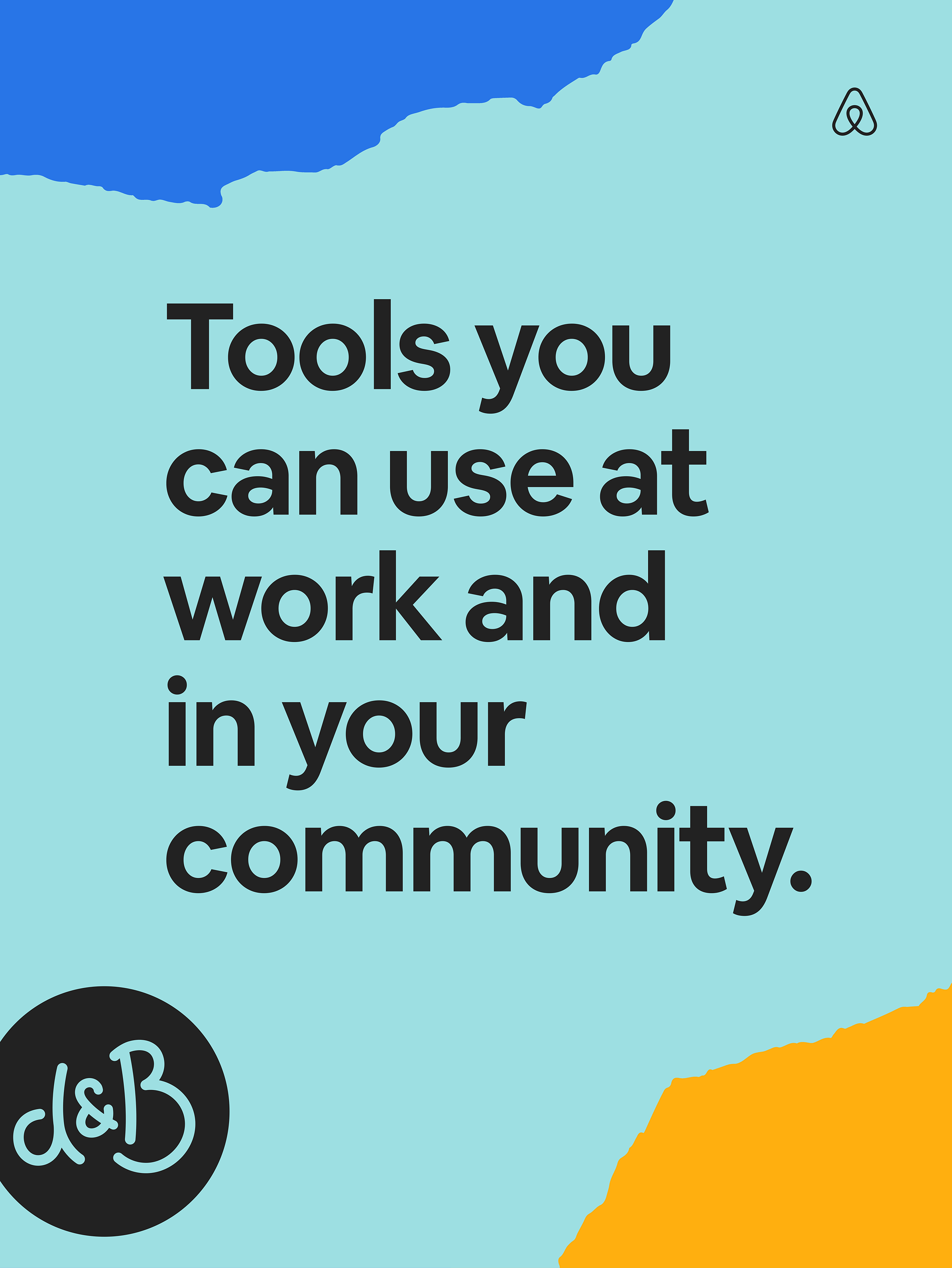
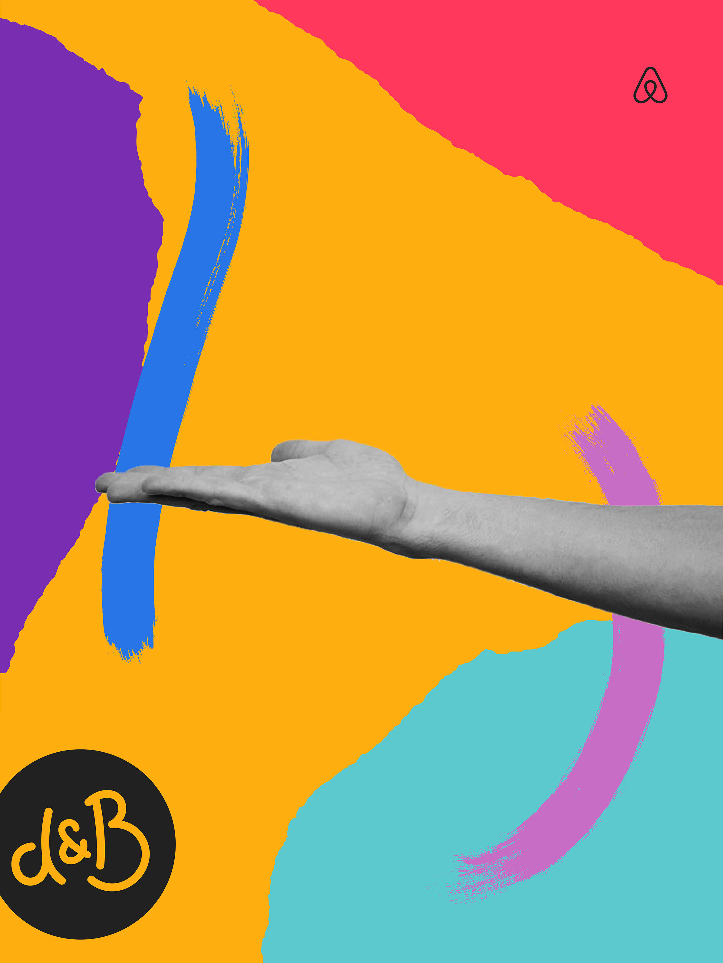
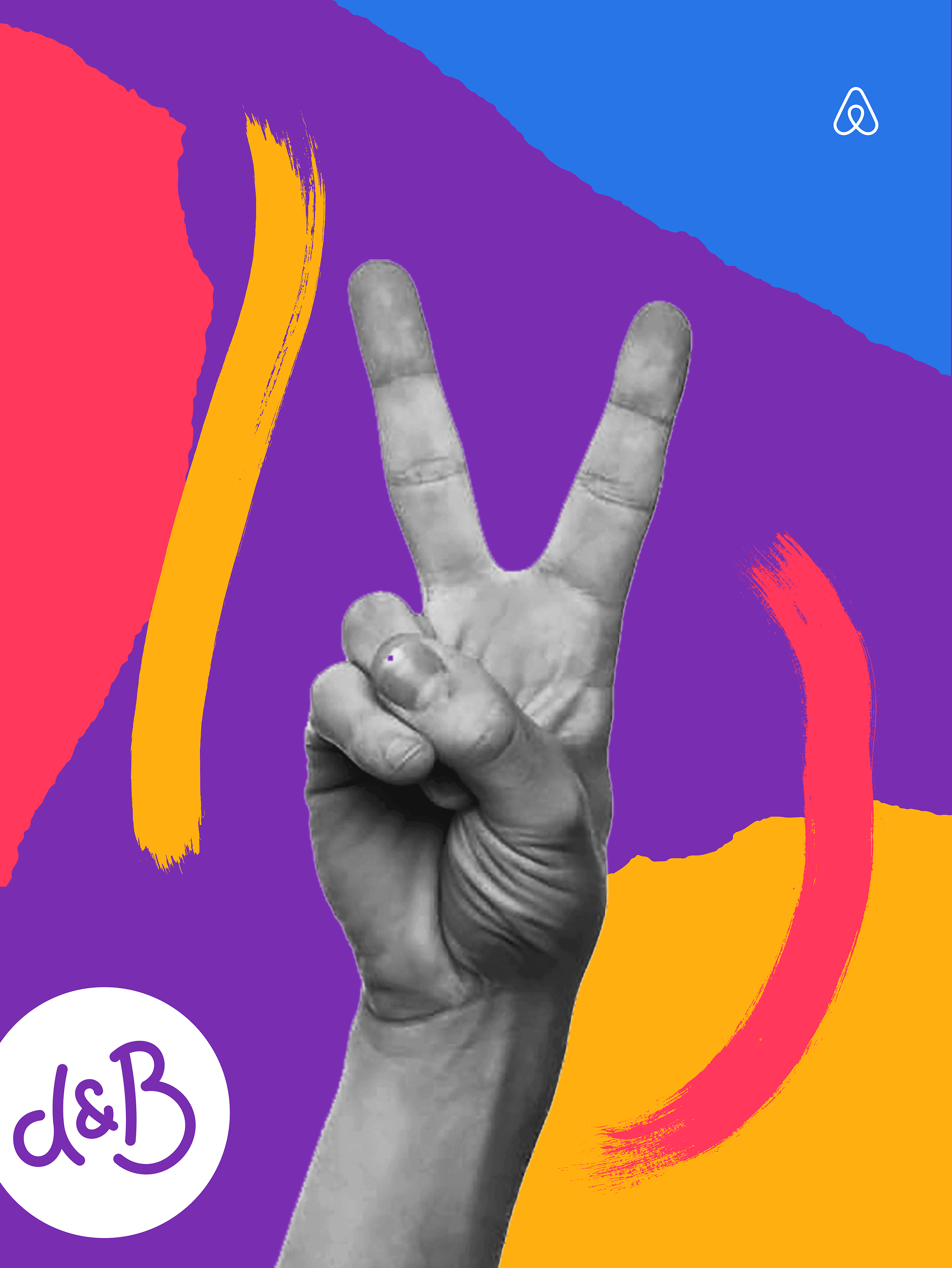
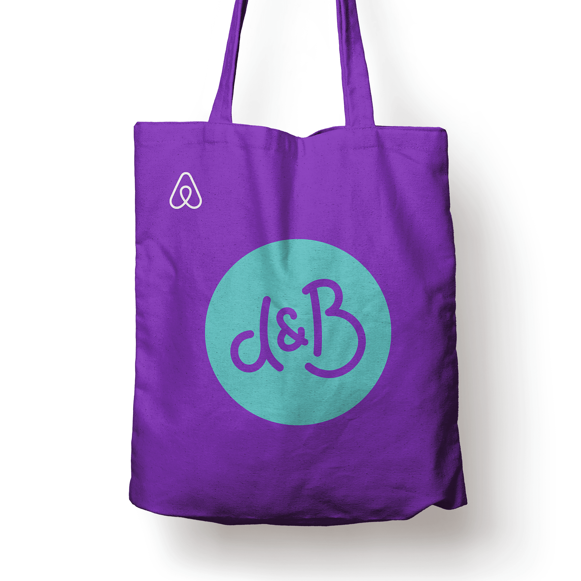
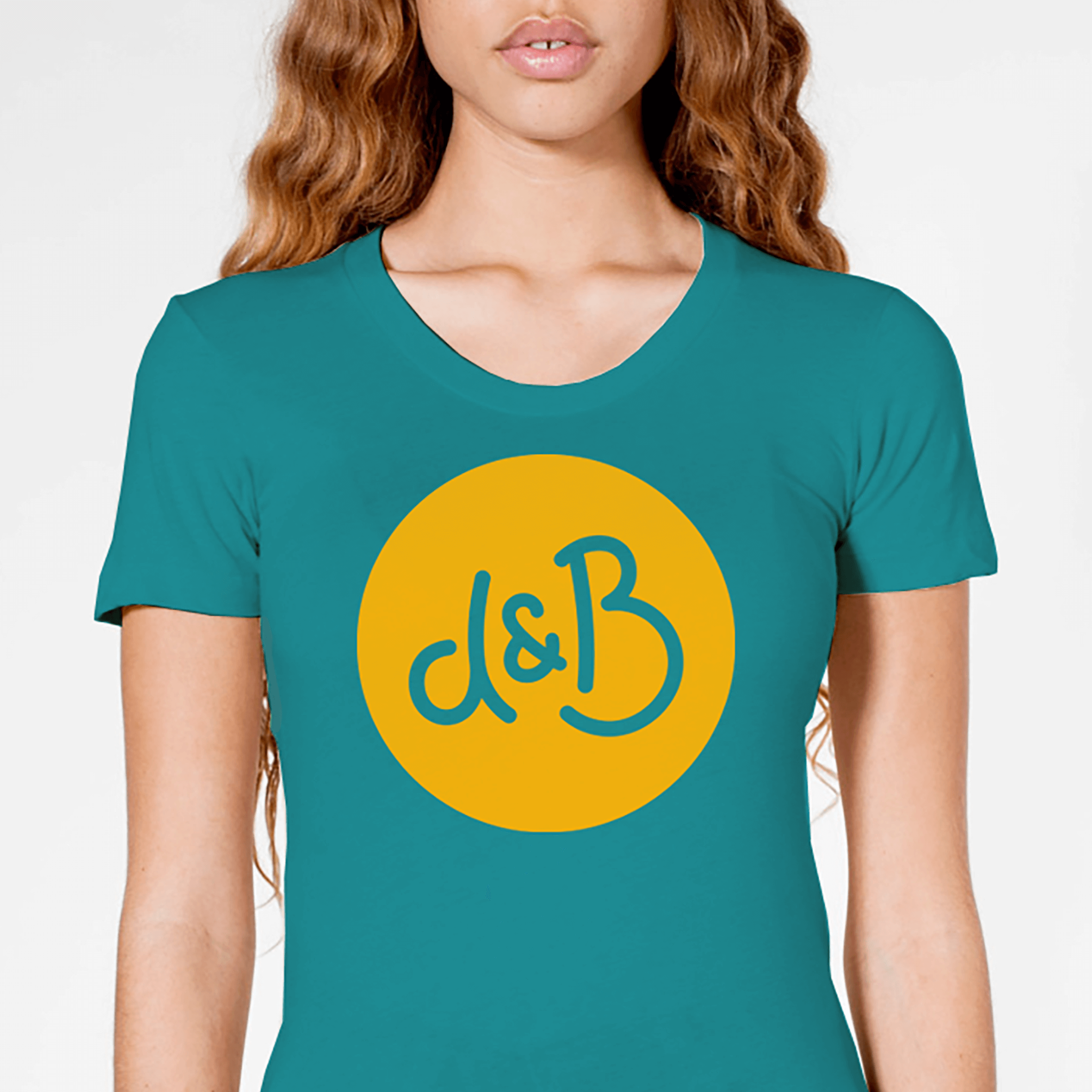
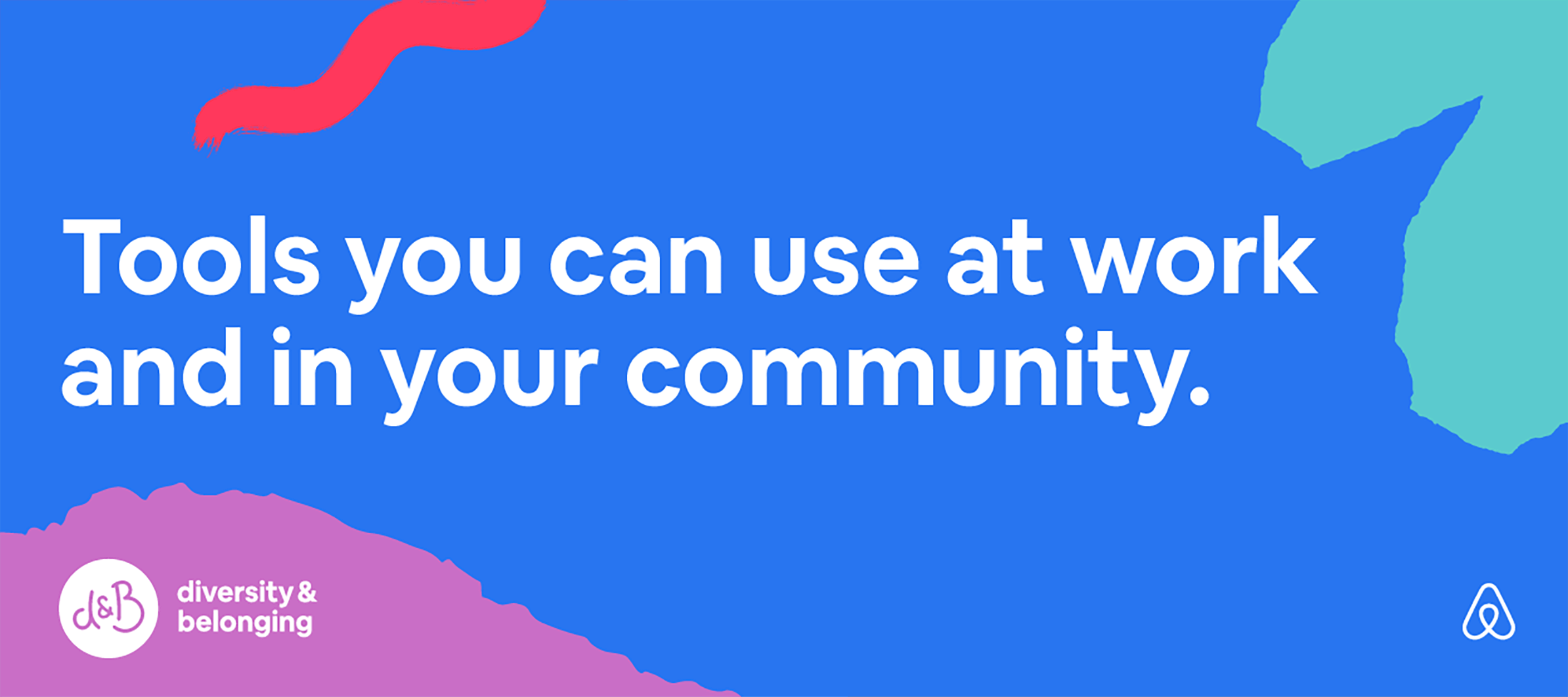
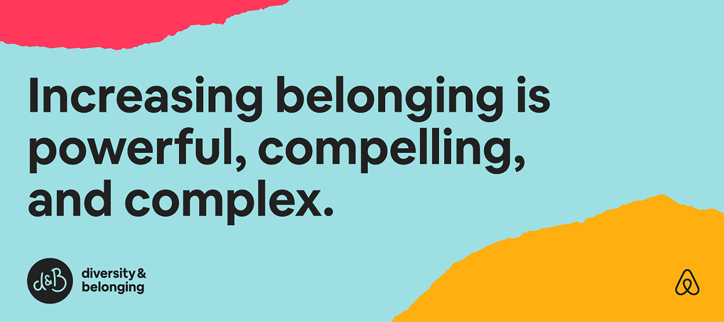
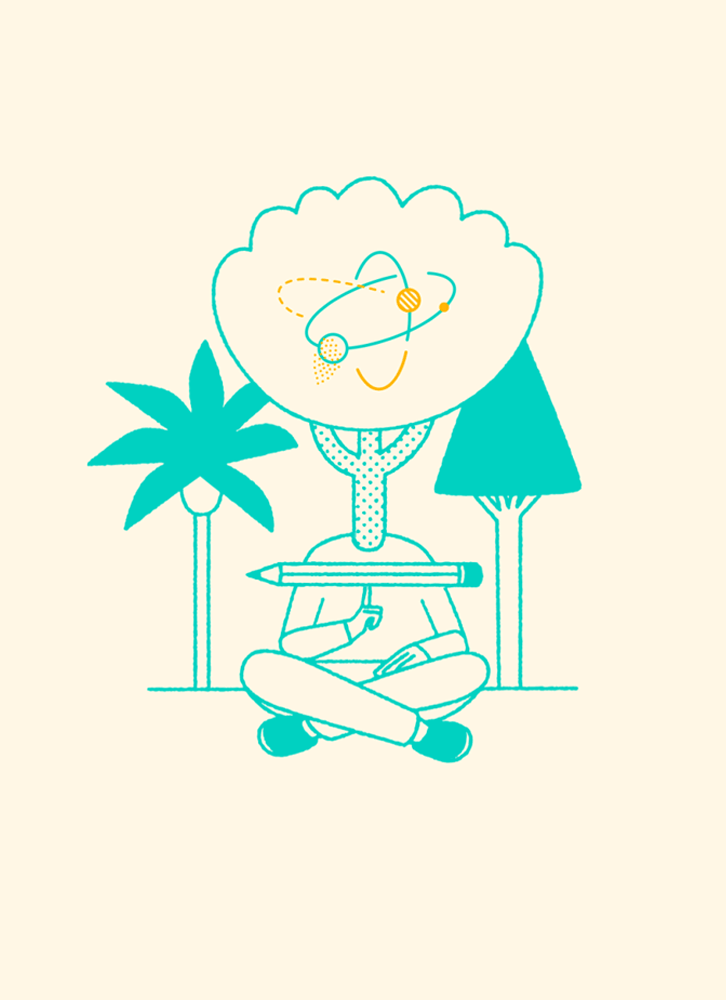
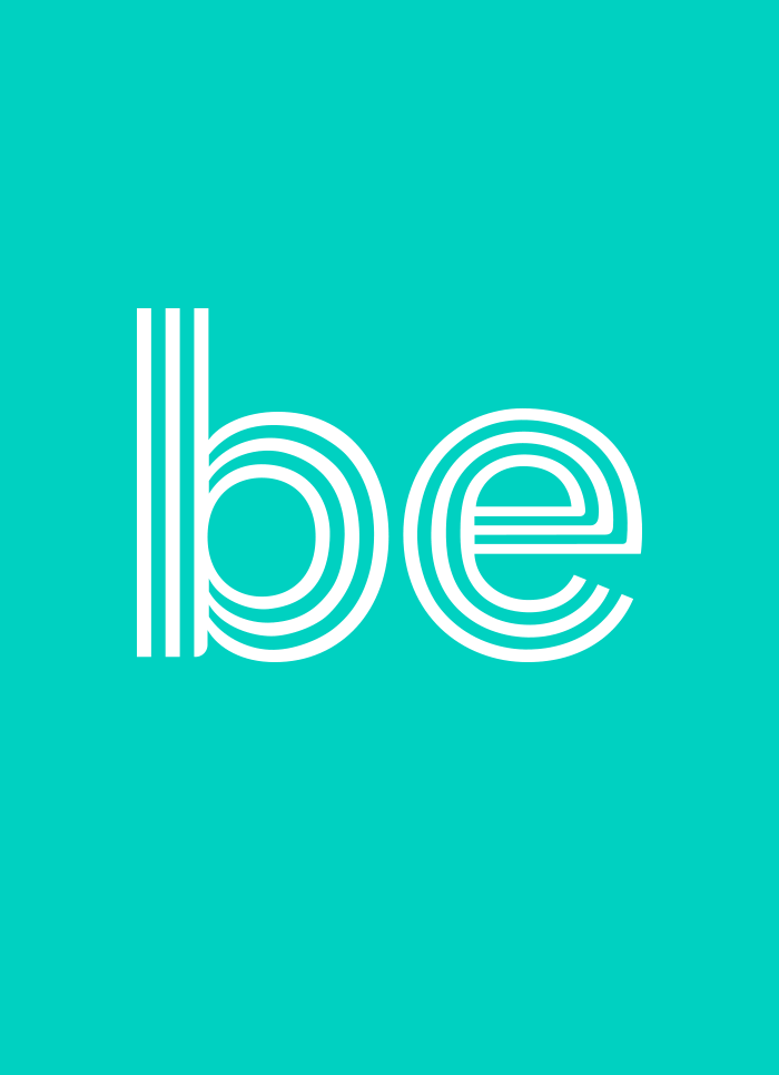
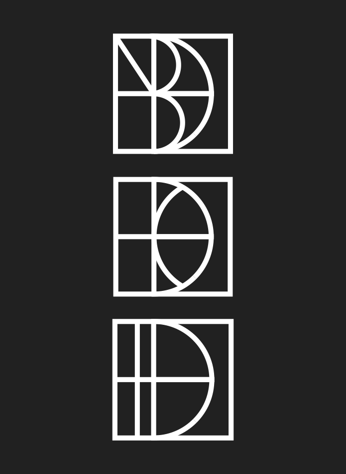
In 2020 we were tasked to create an identity for Airbnb’s newly established Diversity and Belonging initiative. Working in close collaboration with their internal team, we developed an active and varied system that celebrates diversity and change. The core mark is a friendly hand-drawn monogram whose line quality references Airbnb’s ‘Belo’ logo. Paired with organic shapes and hand-drawn marks, the brand system aims to feel human and energetic. Together, the logomark, palette, visual language, and typography, constitute a robust system that can flex to their digital, environmental, and print needs.