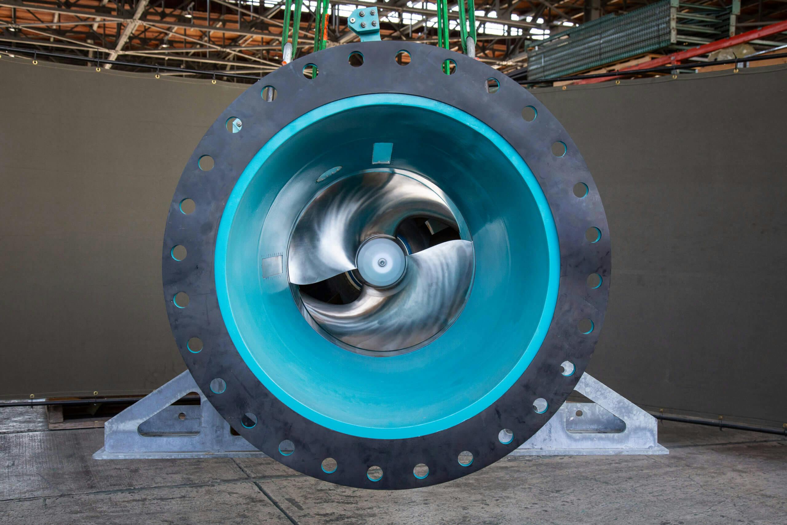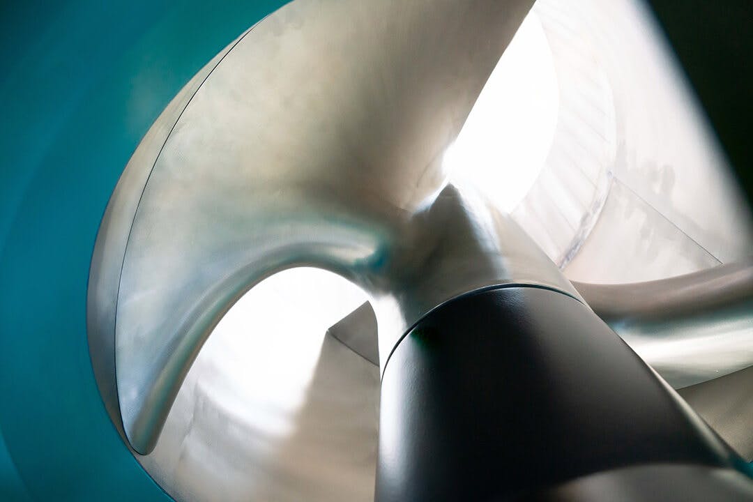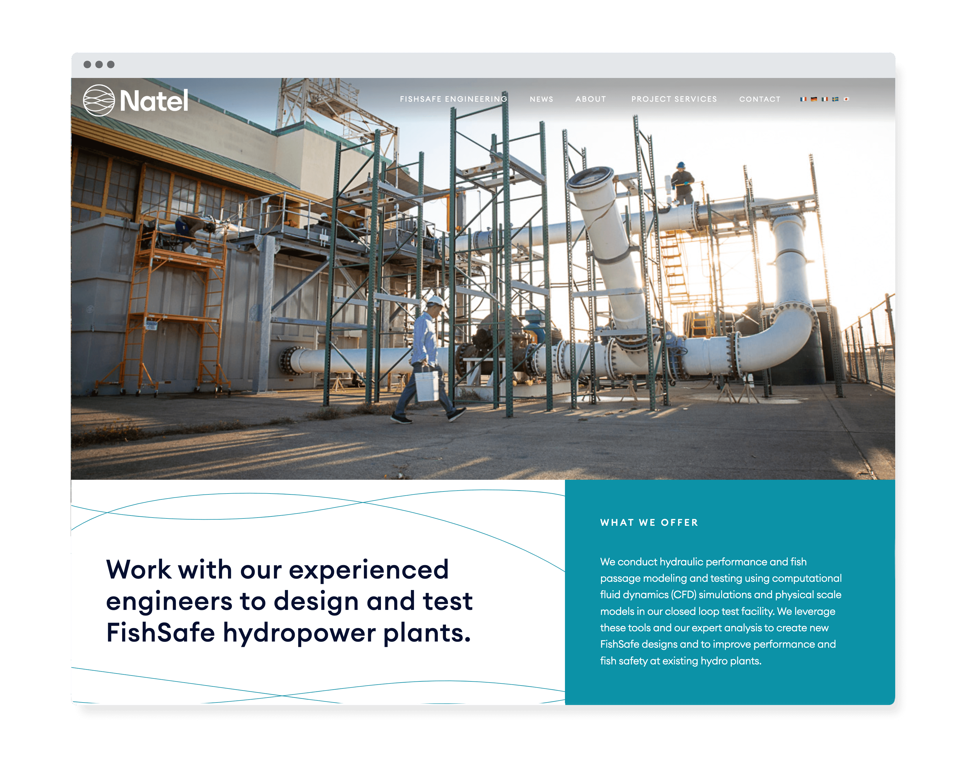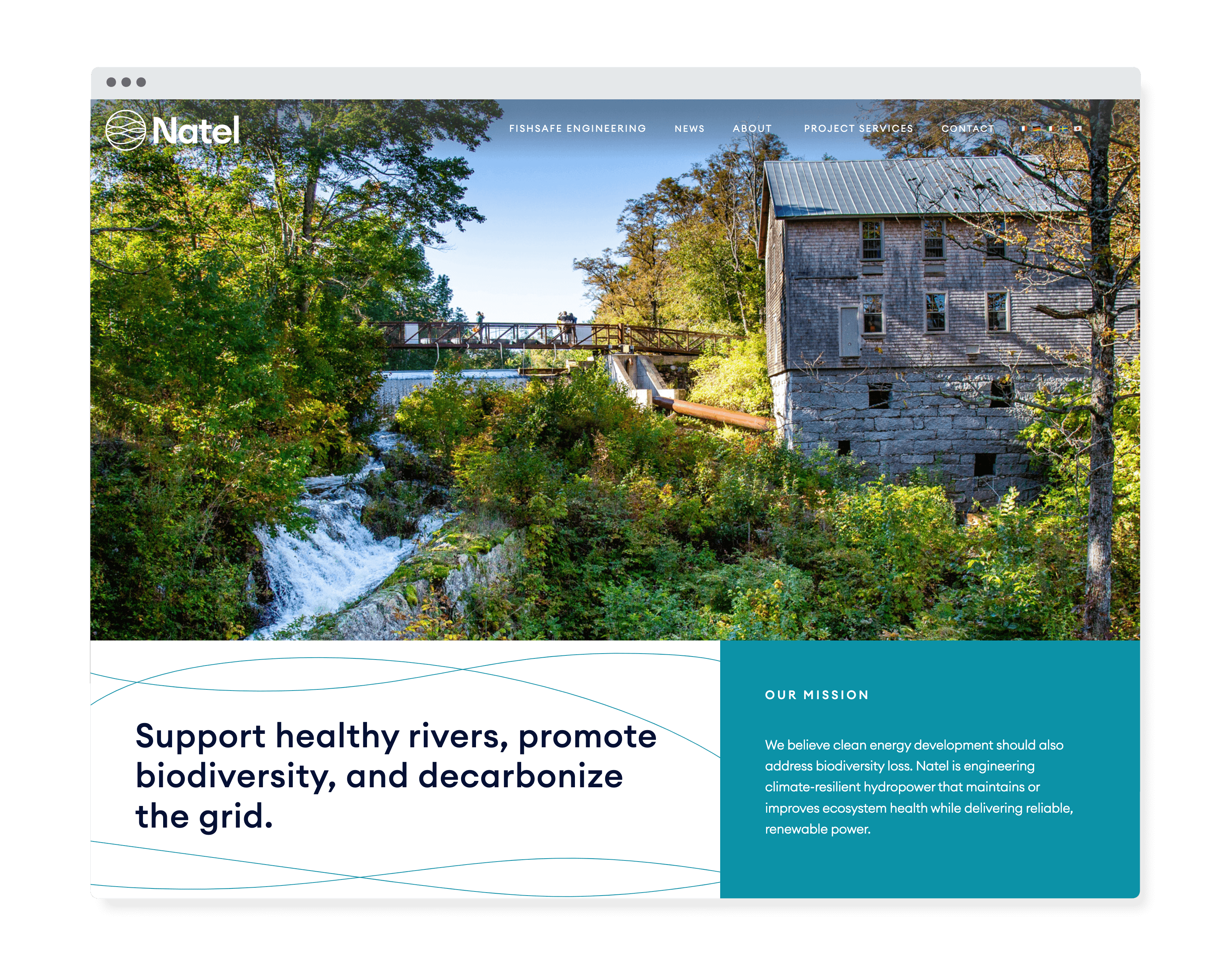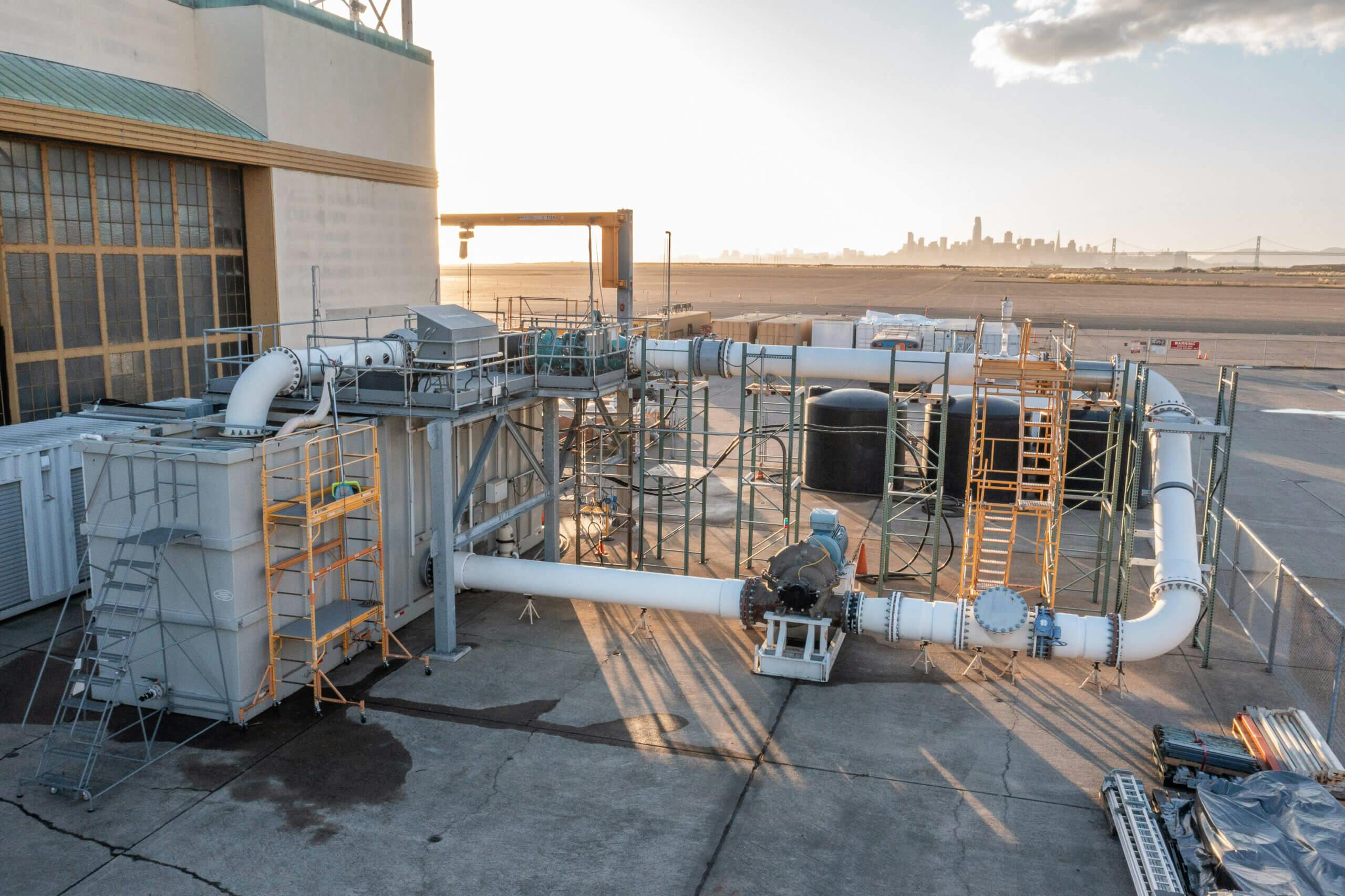
Natel is a high-performance, FishSafe engineering company: providing green power that doesn’t sacrifice wildlife in the process. Situated in a hangar on the retired Alameda, CA, Navy Base, they perform feasibility studies and testing on their turbines, while collaborating with firms worldwide to license and implement their designs. As Natel grows alongside the demand for clean energy, they recognized the need to revamp their branding to better reflect their evolution.
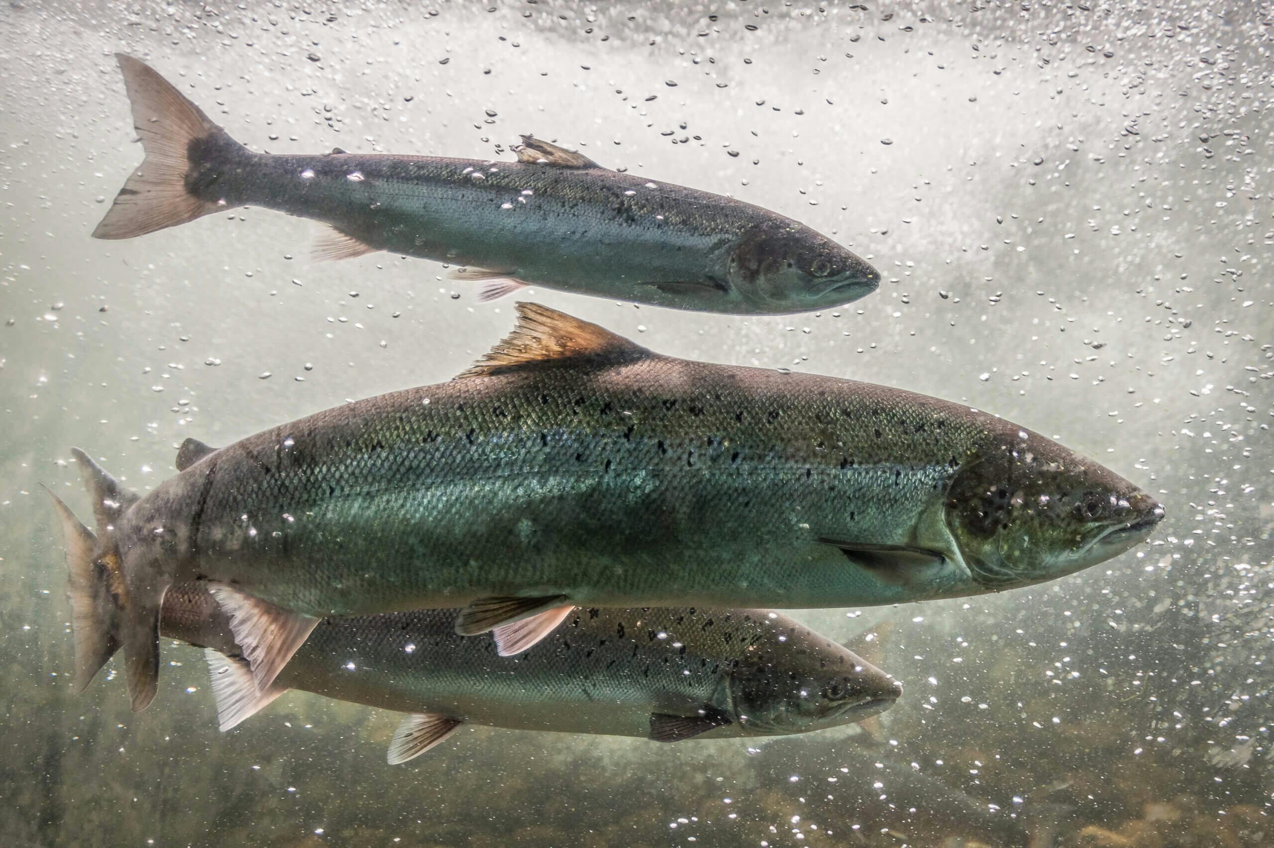
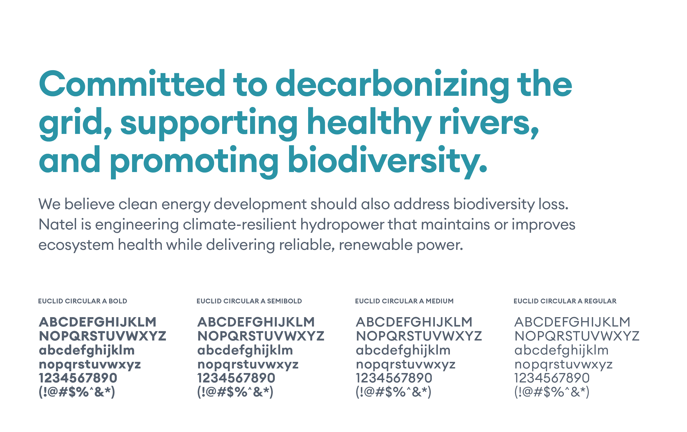
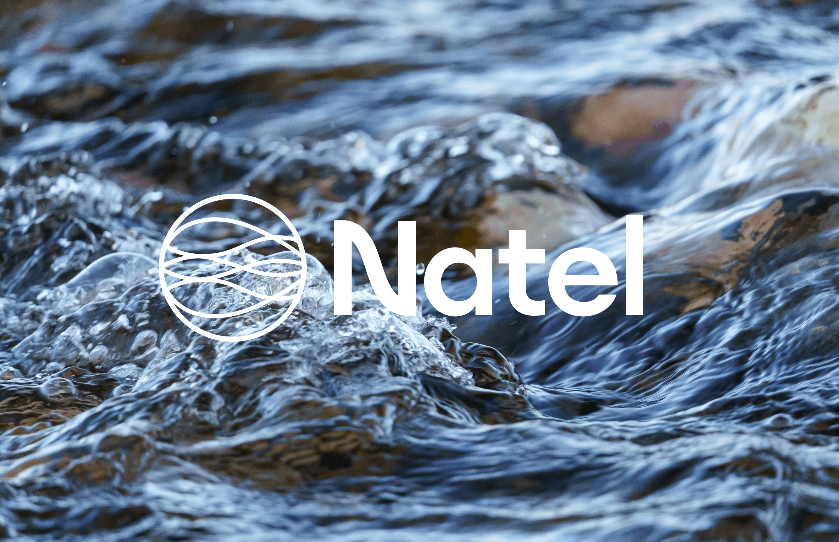
We transitioned their brand language from their previous logo to one characterized by organic curves, symbolizing the flow of river currents, turbine blades, and schools of fish. This is paired with a wordmark where the “N” tapers in a wave-like curve. Retaining their signature color Nateal, akin to John Deere’s green or Caterpillar’s yellow, we expanded their palette and modernized their typography. These core elements of the updated brand come together in the refresh of their website as well as other important company collateral.